 This piece by Louise Byrne in the Times Higher Education supplement, dares to suggest that academic gowns don’t work so well for everyone. Specifically those without the broad shoulders and strategic buttons necessary to secure the hood, and even more specifically shorter people, say, those under 5’ 2”.
I am pleased, because this means I am not the only dissenter, having recently faced a barrage of criticism from lovers of pomp and tradition, when I complained to colleagues that wearing academic dress made me feel trollopsy, and that I would prefer not to wear it to present my students at graduation.
I am not against tradition, nor against ‘dressing up’ for the occasion. I just hate feeling hot, anxious about needing to prevent a variety of wardrobe malfunctions and generally looking over pleated, as I stand in front of a huge audience of parents, being videoed as I attempt to focus on getting the names right and not fluffing the lines. A costume should enhance a performance, not hinder it.
Seriously who designs these things? Well, Viviene Westwood has designed a series of robes for King’s College, where at least the hood appears to be attached to the shoulders of the gown, rather than the traditional slip over horror, which demands complex wielding of safety pins, which in turn make holes in your clothes.
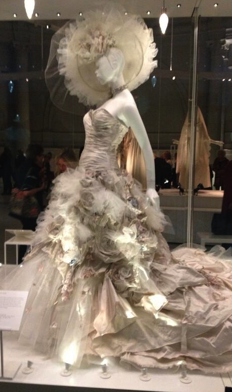
But still, all the pictures on the website show tall girls in significantly high heels, with gowns which don’t meet in the middle. I recall Vivienne’s iridescent violet wedding gown for Dita Von Teese (currently on display at the V&A’s Wedding Dresses exhibition), and I am perturbed. Vivienne, this gown is spectacular. Can you not then, design a graduation gown that flatters the majority of us, without the puffery and unworkable accessories, and which fastens at the front?
At least the new King’s College gowns come without hats. Even Henry VIII looked a bit of a chump in the pancake-like headwear which is supposed to be a reward for getting a PhD. Better to stick with the mortarboard rather than suffer the indignity of the floppy beret flattening your fringe. I don’t mind anyone else wearing a hat, but I am uneasy when in the 21st century some of us face regulations which state that we have to.
Of course many of my colleagues are beautiful people, who carry the pleated shroud off with aplomb. Still others don’t care as they get paid anyway. But in case anyone with sympathy and design talent is listening, here are some hints and tips:
- Black is a good colour. Black is the new black. Not orange and certainly not pale grey (UCL what are you thinking ?)
- Hoods can look imposing and foster scope for customisation of the gown. They should be firmly attached by skilled seamstresses, not safety pins, so that it is unnecessary to choke, hold the ribbon down with one hand to prevent choking, or look at photos of your special day showing the hood slipping down your shoulders.
- Pleats are expensive. They make everyone look fat. Unless you have signed with Models One, you don’t need pleats on the shoulders, or across the back, or anything puffy at all.
- A longer line at the back of the gown makes it flow elegantly, and the drop sleeves from the elbow make the arms look graceful.
- Gowns should aim for mid calf, no longer. There are always steps and hitching the gown up to climb them should be reserved for Gone with the Wind cosplay events.
- Some kind of fastening at the front is comforting. This doesn’t have to be the romper suit zipper going all the way up that I have notice on some US gowns – a single toggle or button with a rope loop is easy, classy and effective. Pulling your gown around you all the time makes you look anxious on stage and deranged on camera.
- A small pocket for the cloakroom ticket would be great, and another way to reduce anxiety.
- Hats; awkward and unnecessary.
- Did I mention black?